
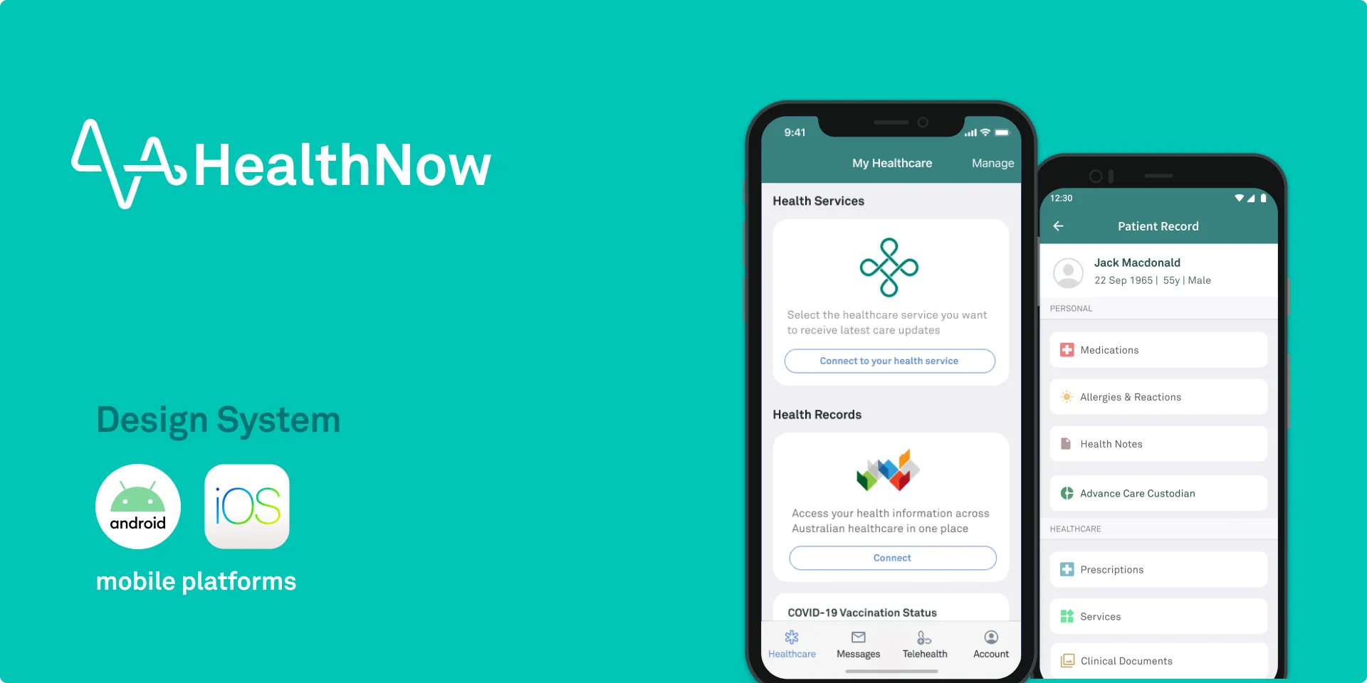
As the product design lead for HealthNow across both iOS and Android, my focus was on simplifying a fragmented patient experience. We shaped the design of key features and built a comprehensive mobile design system from scratch, aiming for clarity and consistency across every interaction.
Opportunities and outcomes
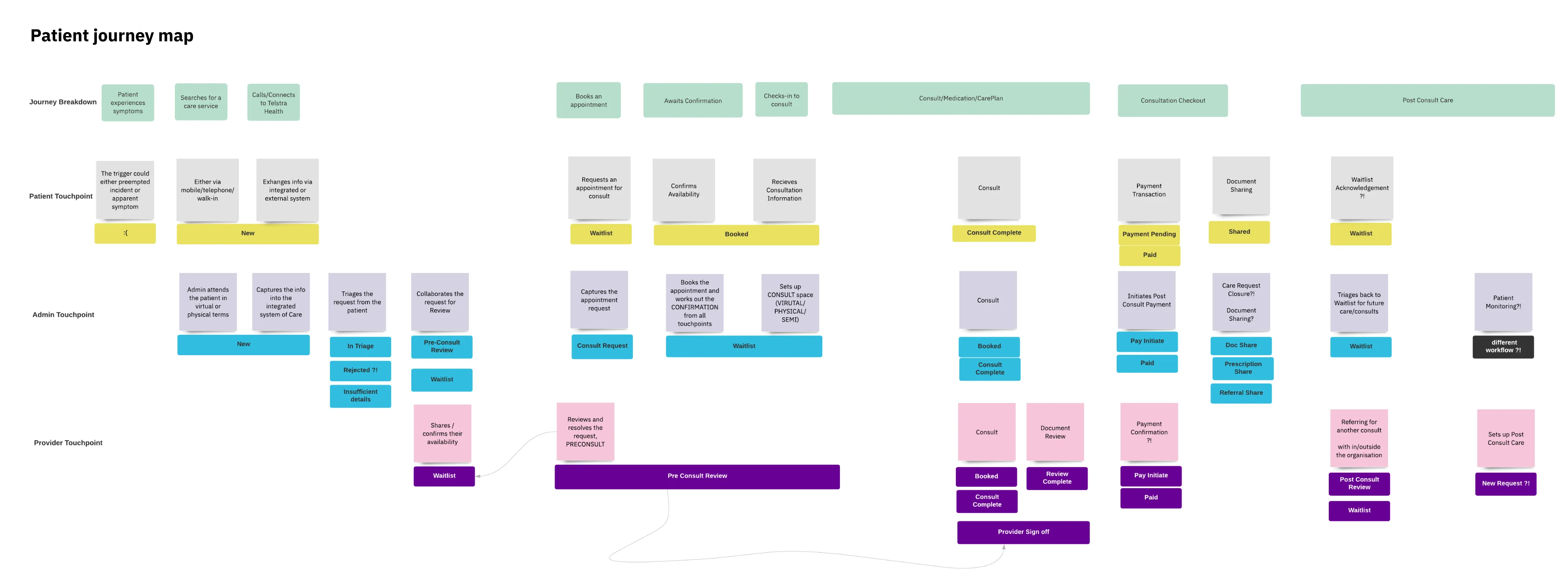
We saw that patients were often overwhelmed, having to navigate multiple websites, apps, and portals to manage their health. The opportunity was to simplify this fragmented journey. We wanted to create one trustworthy and easy-to-use mobile app that put patients in control of their own health information and connected them seamlessly to the care they needed.
My role and design approach
I led product design for HealthNow across both iOS and Android, focused on making the patient experience clear and usable.
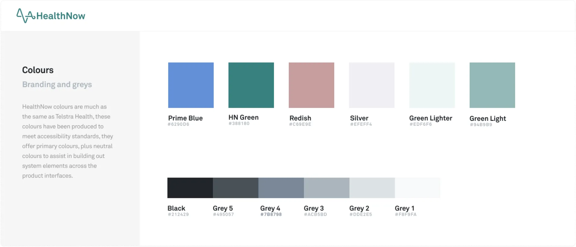
One of my first steps was addressing the inconsistencies between the iOS and Android apps. I led the effort to build a mobile design system from scratch. By analysing existing patterns and user workflows, we created a scalable system that improved the experience and cut down development time considerably.
We used a mix of analytics data and qualitative research to understand how people were actually using the app. This helped us pinpoint friction points, a confusing identity signup process, for example. We designed and tested streamlined flows that made it much easier for patients to get started.
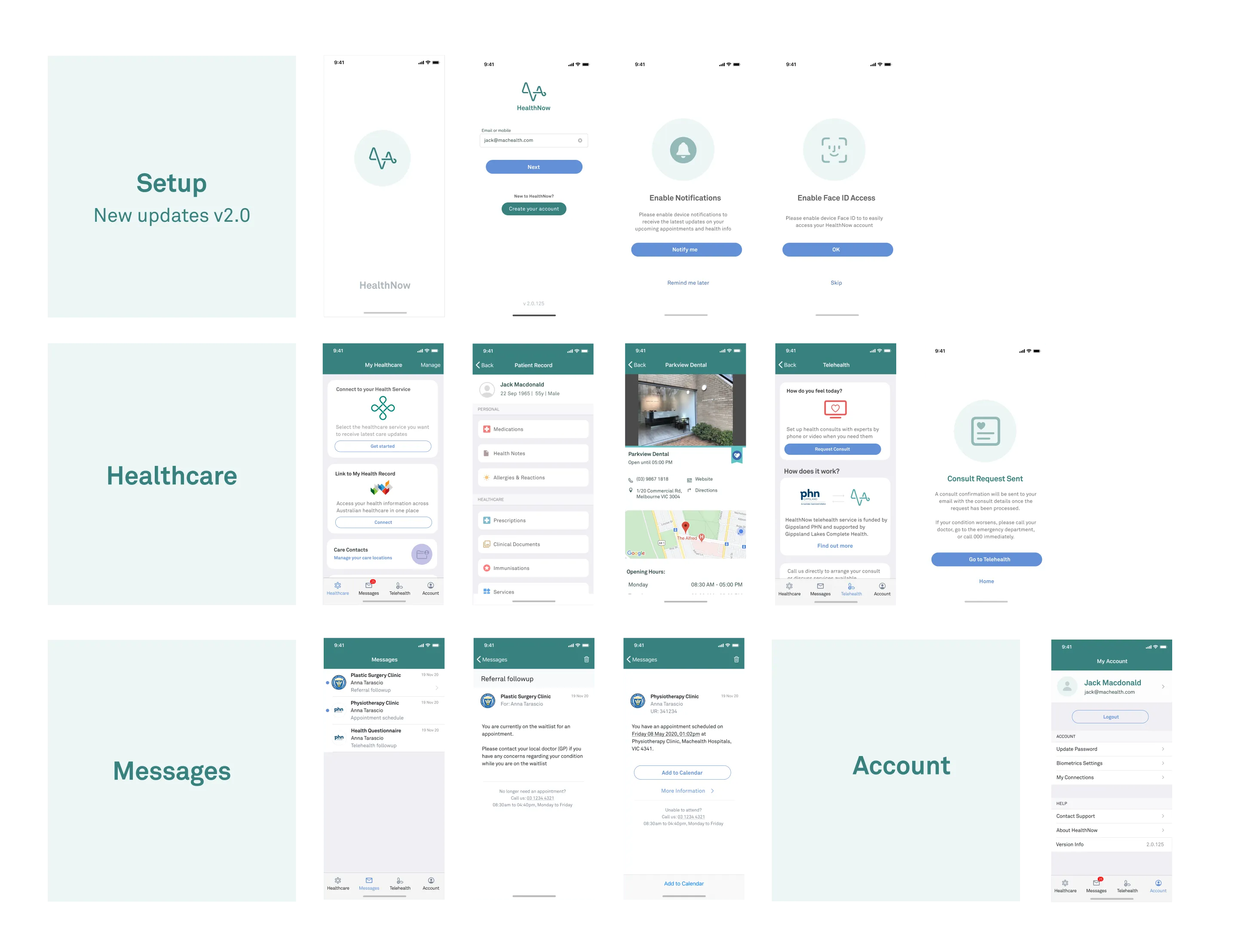
Our design process was built on a cycle of prototyping and testing. I worked closely with the product team to turn insights into interactive prototypes, then put those prototypes in front of patients for direct feedback. Every new feature we launched, from telehealth booking to viewing a COVID certificate, was validated against real needs.
Outcomes
Over 27,000 Australians used HealthNow to manage their health in one place. The mobile design system gave the team a shared foundation that made shipping features faster and more consistent. The app also proved adaptable, when COVID-19 hit, we were able to quickly add digital certificate support, turning it into something patients relied on daily.
What I learned
Taking the time to deconstruct the existing app and build a proper design system felt like an archaeological dig, it uncovered foundational UX issues that we could then solve systematically. The project also reinforced how much you need both the quantitative data and the qualitative feedback to actually understand what patients are struggling with.