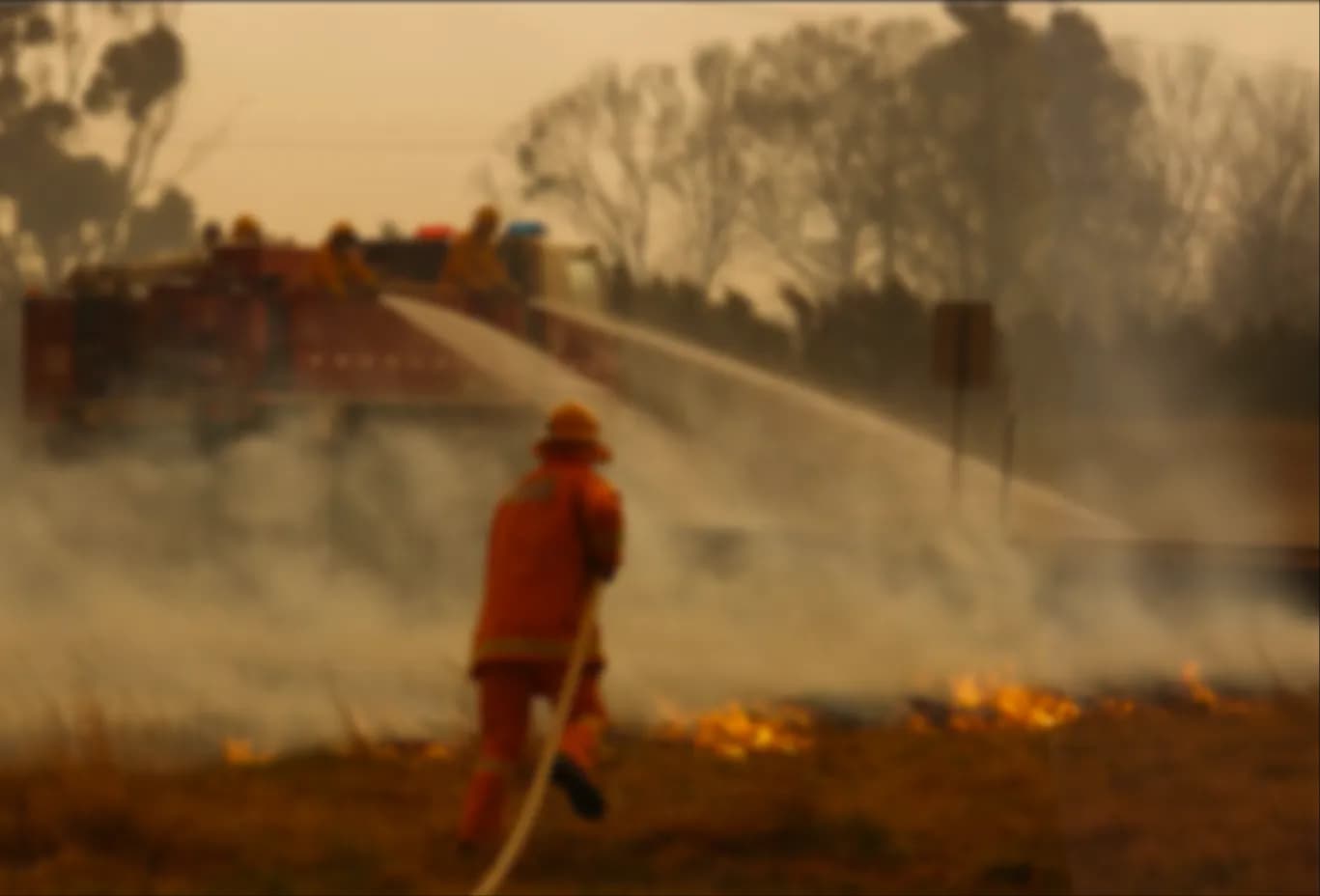
CFA's command staff relied on a desktop system for situational awareness, but the volunteer firefighters in the trucks had no direct access to this information. In a crisis, they needed a tool they could rely on without it getting in the way. My focus was getting crews on the ground the same real-time data, so they could make safer, faster decisions.
The platform
The project involved two interconnected systems: the primary Resource Tracking System (RTS) and its integrations with incident management. The RTS was never a typical fleet management tool. Operational command centres used it to dynamically reroute brigades based on evolving incidents. Because CFA is volunteer-based, firefighters themselves would monitor the surrounding fleet and proactively coordinate assistance. That collaborative workflow meant the existing platform couldn't just be shrunk for mobile. It needed a complete redesign to work in the field.
The existing codebase had legacy architecture dating back roughly 20 years: Java servlet pages, an older version of React with JSX, and a monolithic structure where the backend and frontend were tightly coupled. Any deployment had to push both layers together. That constraint sat behind every technical decision we made.
The custom device
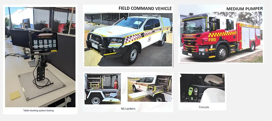
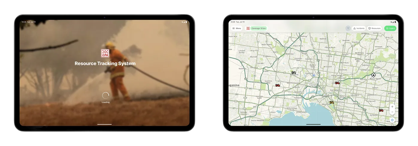
CFA and Android OEMs co-developed a ruggedised tablet with a custom operating system built for extreme environments. The hardened touch glass behaved differently from a consumer screen, which affected how we designed touch targets and input areas. The tablet also had limited power and needed highly optimised performance, since a dead or slow device in the field isn't an inconvenience, it's a safety risk.
The tablets connect via corporate WiFi when in the office and LTE/cellular when in the field. That meant every design decision had to account for variable connectivity, and we needed to understand the data volumes involved in loading map tiles over 4G/5G before committing to a default map configuration.
My role: designing for extreme conditions
Consulting through Telstra Purple, I led the product research and design to get this into the hands of primary fire responders. I worked across the engineering team and coordinated requirements and user sesions along with CFA.
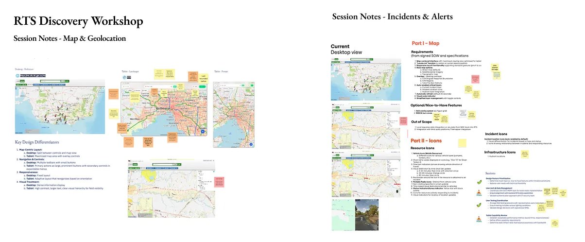
I facilitated five design workshops between April and late April 2025, each with a different focus: tablet adaptation and viewport strategy, map layer requirements with CFA's GIS team, map view defaults and interaction patterns, a full UI design review, and finally the end-user testing strategy. The cadence was deliberate. Discovery, then definition, then design, then validation, all compressed into roughly 3-4 weeks.
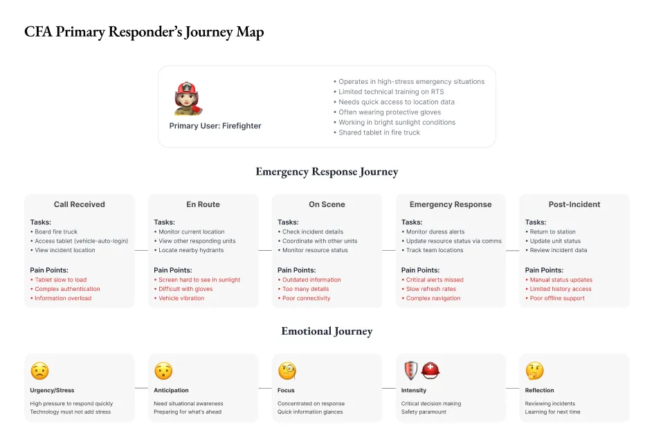
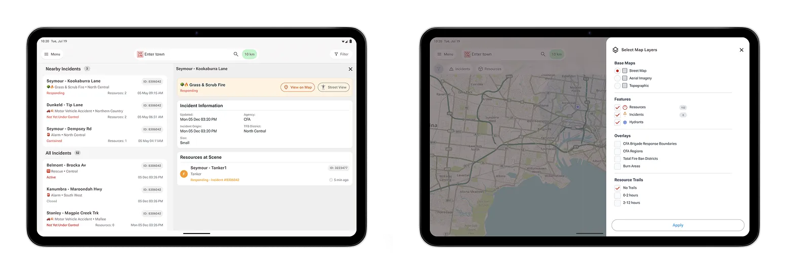
During these workshops with operational staff and primary responders, we mapped the field environment: vehicle vibrations, bright sunlight, the difficulty of using a touchscreen with thick firefighting gloves, and how crews prioritise and locate resources during incidents. Those conversations fed directly into design decisions. We set a 10km default zoom radius, pushing back on an initial 50km proposal because it better matched how crews actually work in the field. Rural users could adjust this in their local settings if they needed a wider view. We chose colour base maps over greyscale because water points weren't visible without colour differentiation.
I designed a mobile design system that was platform-agnostic but drew on common patterns from Android and iOS, so the interface worked whether someone was jabbing at it with thick gloves or tapping with a tiny stylus. Where the desktop version relied on hover interactions for things like latitude/longitude coordinates, I replaced those with drop-pin and touch-activated displays. Table views became list formats for better touch usability. Plus/minus zoom controls were added because pinch-to-zoom doesn't work reliably with firefighting gloves. Every one of these came out of a specific conversation with a responder about how they actually use the tool under pressure.
One hard design problem was helping crews make sense of multiple simultaneous events. The solution uses location data to prioritise incidents and resources on the map, so firefighters can immediately see what's most relevant relative to their position. The incident display shows location, region, incident type, resources attending, and incident ID, stripped back from the desktop version to only what matters when you're responding.
The existing RTS had no formal training. The interface was expected to be intuitive enough for commanders to figure out. For the tablet, I replaced the existing PDF documentation, which was impractical on a mobile device, with native in-app help content. Icons and key definitions are accessible via contextual pop-ups, and the help guide is broken into discrete sections so users can find what they need without leaving their workflow.
For a shared device in a fire truck, standard user authentication was a barrier, since each brigade operates with a crew of responders. We designed a vehicle-based group authentication system using Active Directory integration, where the tablet authenticates via a different URL with role-based filtering that protects sensitive radio information. The entire crew gets instant, secure access without individual logins or passwords to remember while responding to a call.
Navigating the mapping ecosystem
The mapping infrastructure was the area that took the most back-and-forth. The RTS viewer sourced its base maps from EMV, but CFA needed to migrate to their own maintained maps. The current aerial imagery was 7-8 years outdated, and newer versions used a different datum and geographic system, which created alignment issues we had to work through carefully.
I coordinated directly with CFA's GIS team, alongside our engineering team to evaluate options. We investigated Esri base maps for currency, explored whether Google satellite imagery could be integrated through existing EMV feeds, and assessed CFA's own Esri web service for the water points and hydrants layer. That service had built-in zoom-level behaviour where hydrants only appear at appropriate zoom levels, which lined up with what we'd heard from responders about not wanting noise on the map.
The mapping work also required aligning overlays: brigade response boundaries, CFA regions, total fire ban districts, and the new hydrants layer. Getting these right wasn't just a technical exercise. Each overlay affected how commanders read the operational picture, and the zoom behaviour had to be calibrated so the map remained useful at every level of detail.
Throughout the workshops and design phase, I sat between CFA's operational stakeholders and Telstra Purple's engineering team. I finalised the product backlog with our product sponsor and wrote the user stories before engineering started. I created the requirements documentation on with Figma design and technical specifications, along with functional requirements, so both teams had one place to refer. I set up Jira board access and made sure everyone had visibility of what was being built and why.
Validation
We planned user testing in three phases: first with selected group of CFA volunteers, then with the broader working group, and finally with proof-of-concept users from CFA brigades. We identified the district commander as the right person for field feedback. Each session ran 30 minutes using a clickable Figma prototype rather than the live application. This was a deliberate choice so we could test the design intent without being blocked by engineering timelines.
I built the prototype, proposed time slots, and coordinated session logistics along with CFA. Sessions ran via Teams to accommodate the schedules of volunteer firefighters who have day jobs and emergency commitments. Once we gathered enough feedback, we incorporated all the feedback into the design specification. That quicker iteration cycle meant we were testing a tighter design by the time we locked the prototype.
The timeline was compressed. The project kicked off with the engineering builds, CFA staff were occasionally pulled away by actual emergency operations. Planned burns were ongoing during our development window. The system also needed to support 250 to 1,000 concurrent users at scale, which added weight to every performance decision.
I refocused the original design timeline by descoping map layers into a separate workstream, which kept the core tablet experience on track.
Outcomes
We validated the mobile product through a structured field trial with volunteer firefighters, and the system held up in simulated emergency conditions.
Crews now have immediate access to the location of incidents, resources, and water hydrants. Through multiple iterations, the solution evolved to account for the workflows that actually matter in the field: resource prioritisation during events, event alerting, and coordination with multiple internal and external GIS systems.
The trial confirmed that the design works under pressure. We planned a two-phase production deployment: an initial release after UAT completion, followed by a secondary deployment once remaining components were finished. We're currently in a gradual rollout of the mobility fitout to the brigades. We ran the delivery using Kanban with daily 15-minute standups, which gave us the flexibility to respond to shifting priorities without losing track of where we were.
What I keep coming back to from this project is that designing for extreme constraints isn't about cutting features. It's about knowing which decisions carry the most weight. A 10km radius instead of 50. Colour maps instead of greyscale. Plus/minus controls instead of pinch-to-zoom. Each one is a small call that compounds when someone is wearing gloves in the back of a truck, trying to find the nearest water point.