
My brief was simple: make the featured fares discovery and booking convert better. I led the UX overhaul that lifted conversions, and along the way we changed how the team shipped.
The challenge
The way Emirates showed promotional fares was dated and scattered across web, mobile, and email. Rollouts took weeks, and customers had a hard time finding the best deals. We needed one responsive experience that converted better, and a faster way of working to keep it moving.
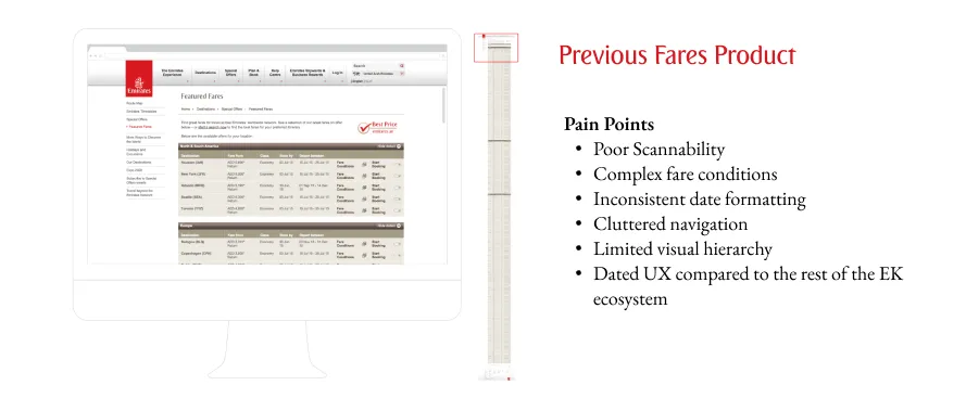
My approach
I leaned on quick iteration and real user data, and used the project to show that agile could work inside a conservative corporate setup.
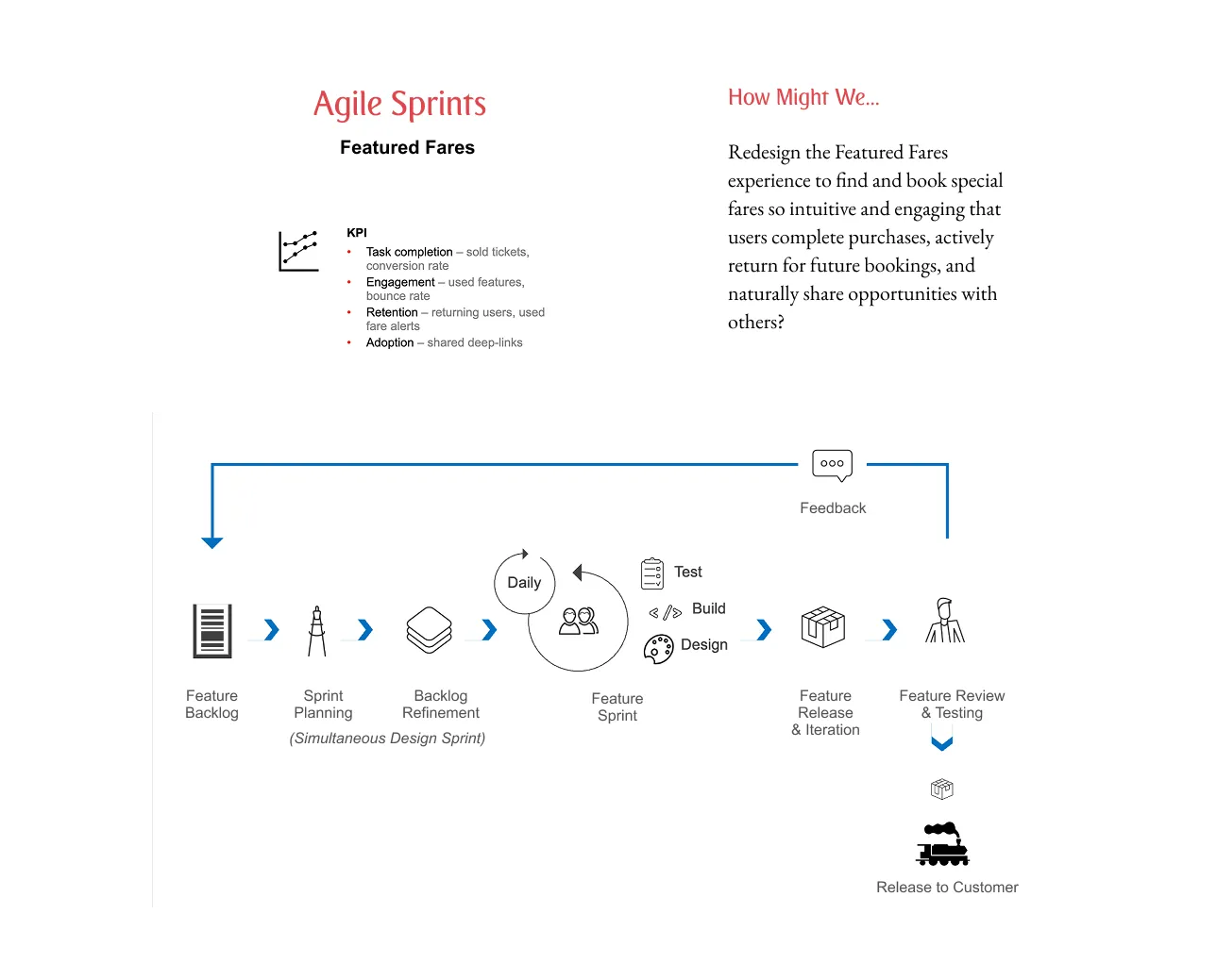
We spent the first design sprint just understanding behaviour, digging into search patterns from over 500,000 monthly visitors and researching across key markets to map the whole booking journey and find where people dropped off.
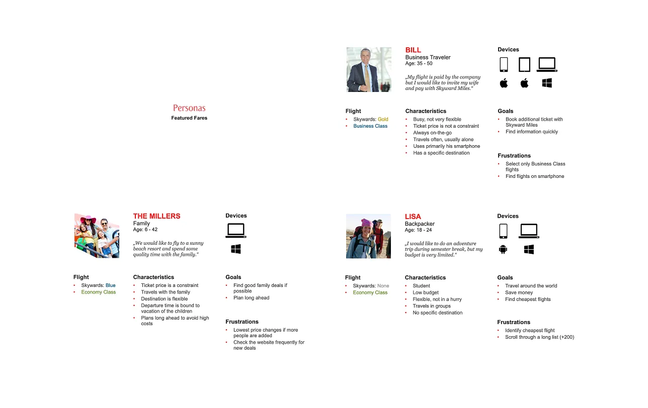
From there, I ran the team through two-week sprints, building and testing prototypes with real customers on web and mobile, and refining off weekly usability sessions.
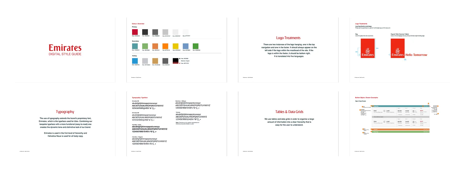
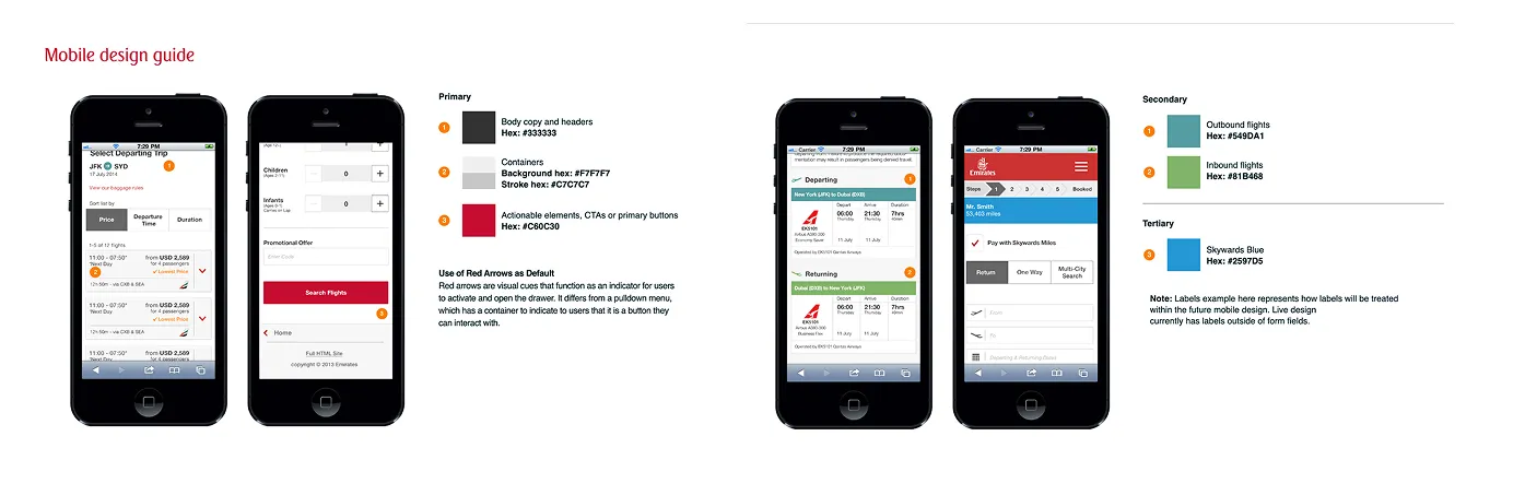
To keep it fast and consistent, I set up a component-driven workflow on our design system. It kept web and the native apps in step and made handoff to engineering clean.
I helped drive the shift to agile: two-week sprints with cross-functional teams, coordinated web and mobile releases, and stand-ups and retros that kept us improving each cycle.
Outcomes
The results showed up fast. Within three months of launch, traffic to fare pages was up 14% with a solid lift in booking conversions, and the new component workflow cut design-to-development handoff from two weeks to three days.
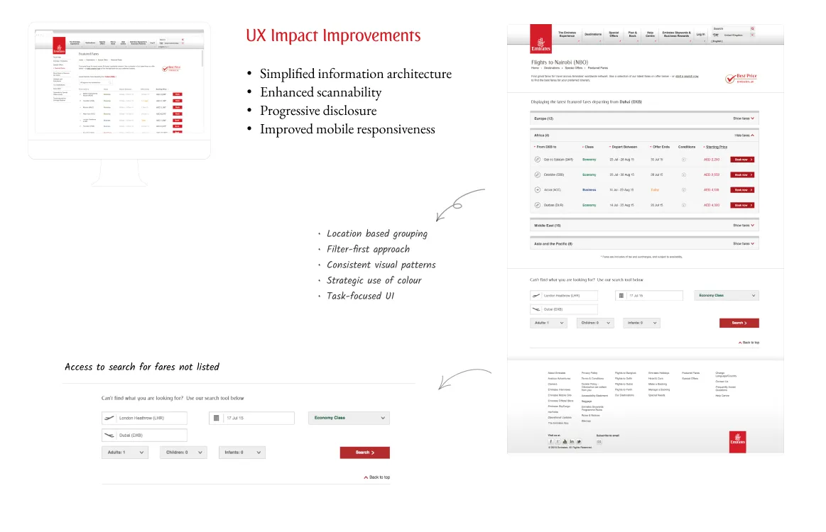
Shipping customer improvements every two weeks proved agile could work at Emirates' scale, and it nudged the wider organisation in the same direction. The design standards we set stuck around on both emirates.com and the Emirates Airlines apps.