


 For the better part of a decade, I've watched the world of digital interface design become obsessed with a singular, dominant aesthetic: minimalism. Since Apple’s dramatic shift to a "flat" design with iOS 7 in 2013 and Google’s introduction of the original Material Design in 2014, our screens have been defined by clean lines, stark surfaces, and a deliberate rejection of skeuomorphic ornamentation. This era brought us clarity and consistency, but over time, I feel it also cultivated a landscape of visual uniformity. Today, there is a slow comeback of retro themes, right from Airbnb's foray into what feels like a neo-skeuomorphic design and Windows Aero making a comeback.
To me, this feels like more than a simple aesthetic refresh after almost a decade. On one side, there is Google's pragmatic, research-backed effort to improve the interfaces of today and on another, Apple's ambitious, top-down vision to build the architectural foundation that seeks to unify the entire Apple ecosystem.
This is an interesting time to be a product designer of these platforms, and in that sense, this is a deep dive into these two competing platforms, analysing their core principles, foundational elements, and what I see as another decade of implications for users, developers, and the very essence of the interfaces that we will end up using every day.
Deconstructing the Philosophies: Why Now? What Problems Are Being Solved?
To understand the differences between Material Design 3 Expressive (M3E) and Liquid Glass, I think we must look at their origins and motivations. Google's latest iteration is a direct response to a market problem, born from user feedback and quantitative research. Apple's is a proactive, architectural direction, driven by a long-term strategic vision for its hardware and software ecosystem.
Google's Material Design Expressive: A Research-Driven Approach
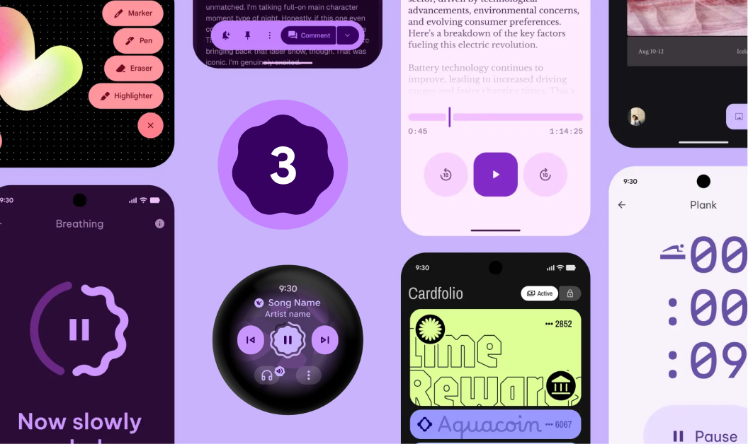
With Material You, its preceding version, the ethos were about personalising design to reflect your preferences, context, and expression, while maintaining clarity, coherence, and accessibility. This process begins with designing your system preferences, including wallpapers and theme colours, which will be reflected throughout the app. I have spent several hours planning for Material You, and it presents a challenge with Android's expansive vendor ecosystem; Material You barely works in most vendor versions of Android. There is a correlation to this from internal research at Google, which revealed that while users found apps built with Material You to be consistent, they also found them to be "boring" and visually indistinguishable from one another. This critique sparked a company-wide debate about the need to inject more "feeling" and personality into the design system, moving beyond mere usability and user-driven personalisation towards genuine expression.
The core philosophy of M3E, as I see it, is that an interface should do more than just function; it should evoke emotion and foster a connection with the user. What I can see from the other side of the fence is how much of that would be easier for the designer to build on. If the toolkit is presumably better than that You, then it will make the apps embody the brand language. Through flexible theming, expressive colour palettes, an expanded type scale, and a library of new shapes, on paper, M3E should provide brands with the means to communicate their unique identity and address the problem of visual uniformity in a crowded PlayStore.
Crucially, Google has learned from its past undoings and anchored this pivot toward emotion in a massive research initiative. This data-driven foundation is both a justification for the new direction and a guide for its implementation. The research yielded several key findings that, in my opinion, form the bedrock of M3E's value proposition:
- Enhanced Usability: Expressive designs, through the strategic use of colour, size, and containment, were found to help users spot key UI elements up to four times faster than their non-expressive counterparts.
- Improved Brand Perception: The new design language boosted key brand metrics, with products being perceived as 34% more "modern," 32% more relevant to "subculture," and 30% more "rebellious" or innovative.
- Strong User Preference: Expressive designs were strongly preferred across all age groups, with a particularly high preference of up to 87% among users aged 18 to 24.
This approach reveals a design philosophy that is fundamentally reactive and driven by the market. For app designers, I see M3E as an empowering toolkit, offering the flexibility to build a distinct brand identity on the Android platform.
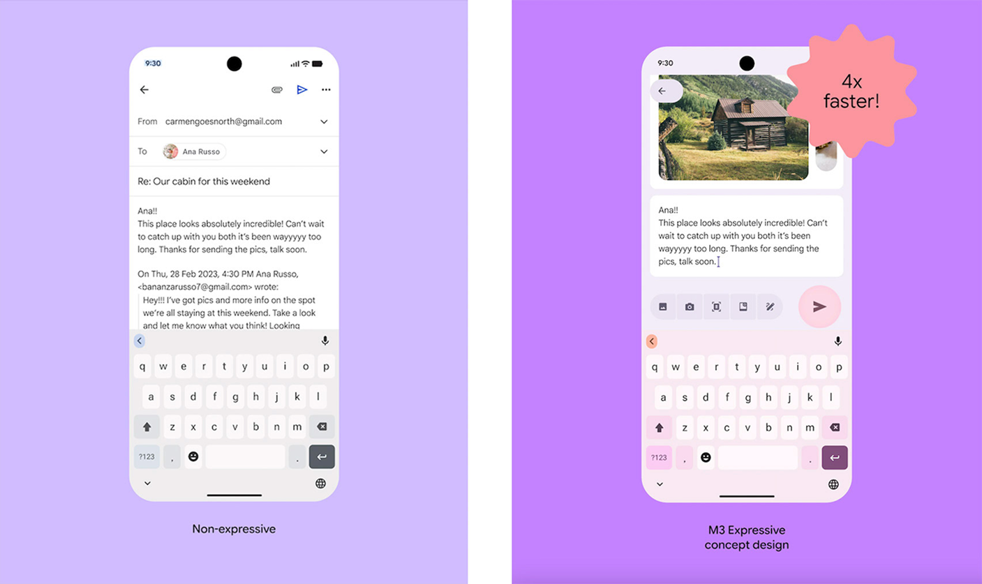
Caption: A graphic from Google's research showing the non-expressive vs. expressive email app, highlighting the dramatic difference in the 'Send' button's size, colour, and placement.
Apple's Liquid Glass: A Top-Down Vision for a Unified, Spatial Future
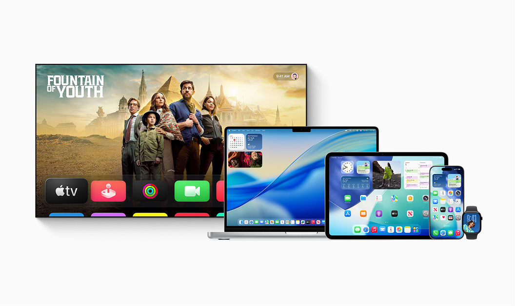
In stark contrast to Google's user-sentiment-driven iteration, Apple's introduction of Liquid Glass is more of a proactive and architectural direction. Its motivation is not to solve a current market problem but to map out a long-term strategic vision. The primary goal of Liquid Glass is to establish a single, harmonised design language that feels physically anchored and visually consistent across every device in the Apple ecosystem, from the smallest Apple Watch to the still nascent visionOS. Its roots are from the design principles developed for the Vision Pro, and bringing its rationale of spatial computing to traditional 2D screens.
The design philosophy of Liquid Glass centres on a new "digital meta-material." Interestingly, it doesn't feel like Windows Aero, and I'm curious to see where it goes. Apple seems to be shaping it not as a new style but as a simulated material with its own physical properties.
Apple describes it as combining the "optical properties of glass with a sense of fluidity," a material that dynamically bends and shapes light in real-time. This material creates a distinct functional layer for controls, like toolbars and tab bars, that "floats" above the content plane, establishing a clear and consistent spatial hierarchy.
The Building Blocks of Experience: A Component-Level Teardown
Over the years, the visual divides of these platforms were thinning but this year's iteration resets the visual aesthetics pretty widely. Let's do a side-by-side analysis of their approaches to the fundamental building blocks: colour, typography, and navigation, and as you can see, they are two distinct paths toward creating a modern UX.
Colour & Materials: Vibrant Palettes vs. Glassy Translucency
From what I can see, Google's M3E builds on Material You's dynamic colour system, giving designers significantly more control to craft vibrant custom schemes. It uses the traditional primary, secondary, and tertiary colour roles to generate a new set of 13 tones per key colour. These tone-based colours are applied to surfaces instead of the elevation-based shadow approach from previous Material designs. This gives each surface a specific tonal colour, making visual hierarchy clearer and more consistent across themes. In essence, M3E loses the shadows while giving us an extensive palette of colours that can be used with purpose, guiding the user's eye and making key call-to-actions stand out.
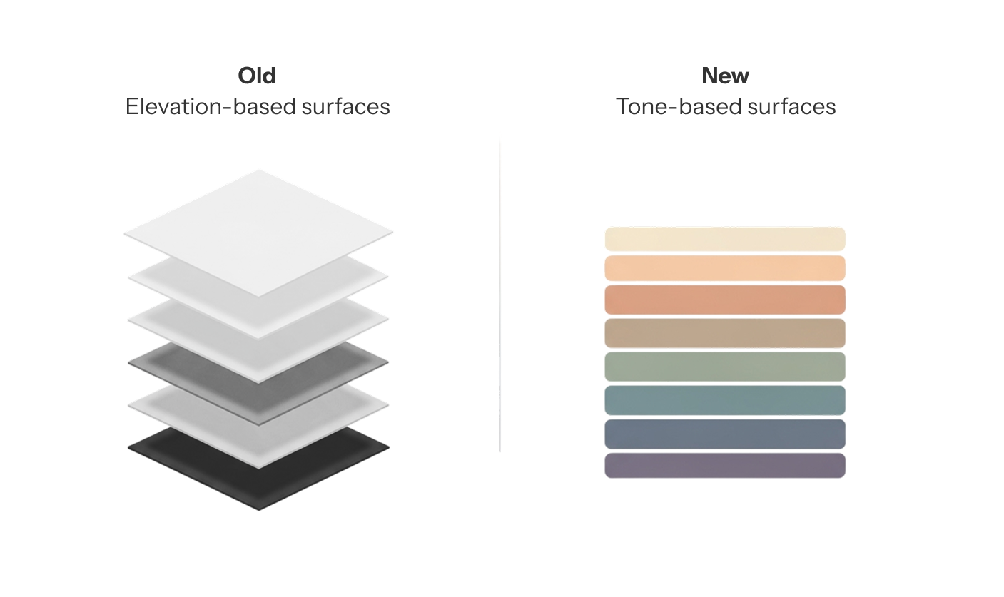
Caption: A shift from shadow-based elevation to tone-based surfaces, left shows the old depth via layers and shadows; right uses the new tonal variations to separate surfaces
Apple's approach treats the material as the source of colour itself. Liquid Glass isn't defined by a fixed hex code; it's shaped by the environment behind it. It’s a translucent, layered surface that reflects, refracts, and adapts in real time. This complex system has several adaptive layers: highlights react to simulated light and device motion; shadows adjust their depth and opacity based on what's underneath them; and tint layers are always adapting, even switching between light and dark modes to make sure text on top is legible. That might be a fair bit of computation but Apple has been historically good at managing it. Liquid Glass comes in two distinct flavours: “Regular” for standard interfaces and “Clear” for media-rich interfaces. Looks like, we can still tint things with brand colours, but Apple indicates that it is meant to be used sparingly, just for key actions that need to stand out.
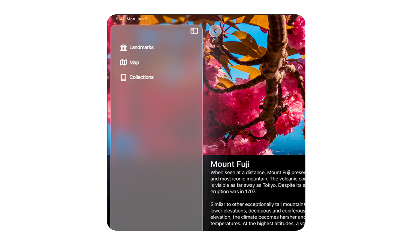
Caption: Apple showing a Liquid Glass sidebar in macOS, clearly demonstrating how it refracts the colours of a vibrant desktop wallpaper behind it.
Typography: Expressive Editorial vs. Dynamic Clarity
When it comes to typography, Google's strategy is about giving designers like me a bigger, more expressive toolkit with 30 type styles and a push for variable fonts. This is double the styles from before, with the new emphasised variants for each baseline style in their Roboto family of variable fonts.
Apple's approach with Liquid Glass is less about giving us a bigger toolkit and more about making the existing one smarter. They have focused on refining their flagship typeface to work beautifully with the new glass material. In general, I've noticed typography in Liquid Glass is bolder and more consistently left-aligned to boost readability in key places like alerts. The real standout innovation, though, is how the font can become a dynamic, context-aware object. You see this most clearly on the iOS 26 Lock Screen, where a special version of San Francisco lets the clock's numbers individually scale their weight, width, and height to nestle perfectly around the subject of your wallpaper.
While Google is giving designers more stylistic choice, Apple is making the font itself an interactive part of the UI.
| Feature | Google Material Design Expressive | Apple Liquid Glass |
|---|---|---|
| Primary Font(s) | Roboto Flex, Roboto Serif, Roboto Mono (variable fonts encouraged) | San Francisco (SF) family, New York (NY) serif family |
| Core Philosophy | Expression and brand personality through editorial styles and variable font axes | Clarity, structure, and dynamic adaptation to content and context |
| Type Scale | Expanded 30-style scale: 5 roles × 3 sizes × 2 emphasis levels | System of built-in text styles refined to work with Liquid Glass |
| Key Innovation | "Emphasised" styles and deep integration of variable font axes | Font characters can dynamically scale to interact with background imagery |
| Accessibility | Dynamic scaling, high-contrast themes, and clear roles built-in | Strong support for Dynamic Type and accessibility sizes |
Navigation: The Bottom Navigation Bar / Tab Bar
In M3E, I've seen Google make some big changes to its bottom navigation. The taller navigation bar from Material 3 is gone, replaced by a new, shorter "flexible navigation bar." This is part of a bigger strategy shift that also gets rid of the navigation drawer on phones, and now the recommended way is to use a navigation rail for bigger screens. A key behavior of this new bar is that it hides when you scroll down a feed, freeing up screen space, and then smoothly reappears when you scroll up.
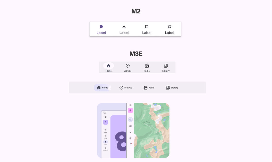 Caption: M3E's Navigation bar and rail showing the differences with previous material design.
Apple's tab bar is a centrepiece of the Liquid Glass, designed to float above the app's content. Just like in M3E, the tab bar cleverly recedes when the user scrolls, shrinking to a minimal state to maximize content, and then fluidly expands back when you scroll the other way. But Apple adds a cool structural twist, the ability to have a detached, role-based floating action button. In an app like News, a "Following" or "Search" tab can be separated from the main group, creating a distinct call to action.
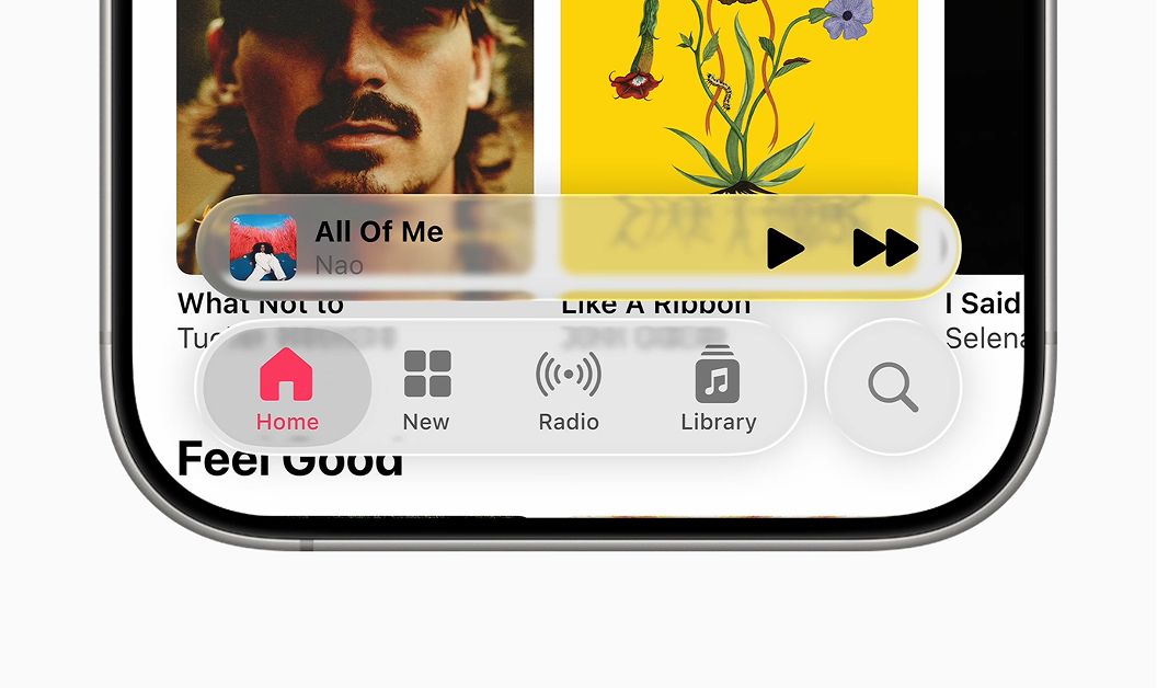
Caption: Apple Music clearly showing the main tab bar with the separate, floating "Search" button to its side.
The Top App Bar / Toolbar
M3E renames the "top app bar" to just "app bar" and brings in new "Medium Flexible" and "Large Flexible" types to replace the old ones. These new app bars are more versatile, with a shorter overall height, bigger title text, support for subtitles, and more flexible ways to include images. The biggest change I've noticed is the move away from drop shadows for elevation. The app bar starts out the same colour as the background (or transparent), and when you scroll, it fills with a contrasting surface colour to create separation. This reinforces that flatter, more colour-driven approach to depth.
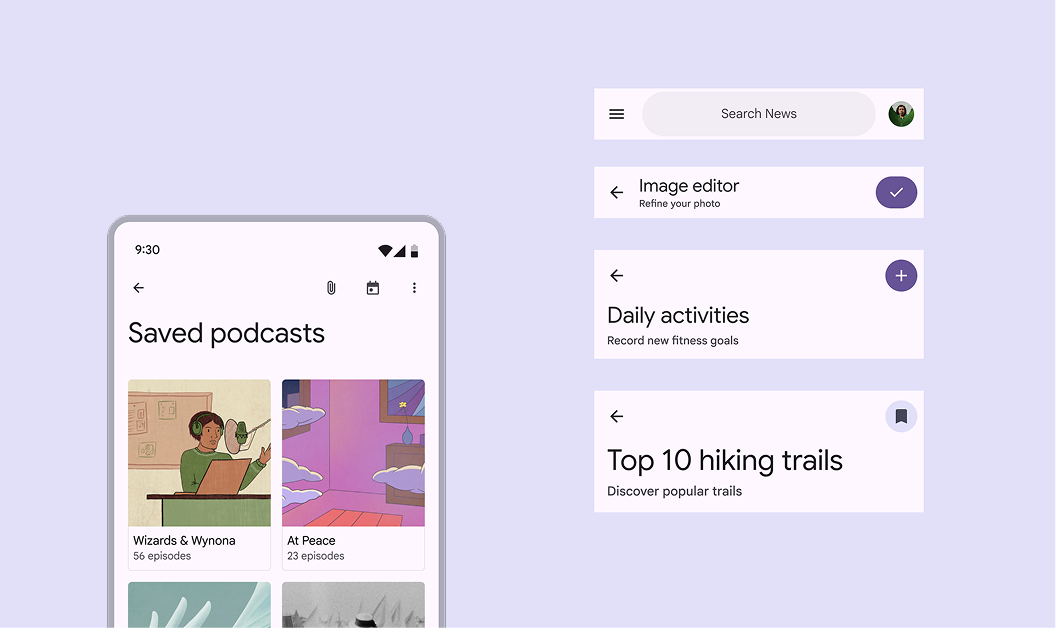 Caption: M3E showing the new app bar that is slicker with support for subtitles and images.
Apple's toolbars are pure Liquid Glass, existing as translucent planes floating above the content. They're designed with a focus on clarity and less clutter. Controls are organised into logical groups, and on iOS and iPadOS, a main action, often a tinted blue "Done" checkmark, is kept separate to create a clear focal point. On macOS, this philosophy goes even further: the main menu bar can become totally transparent, blending into the desktop wallpaper to make the display feel huge, while sidebars actively refract the content and wallpaper behind them. The simplification might seem fine on iOS, but I'm sceptical about it on a busy desktop with multiple windows open.
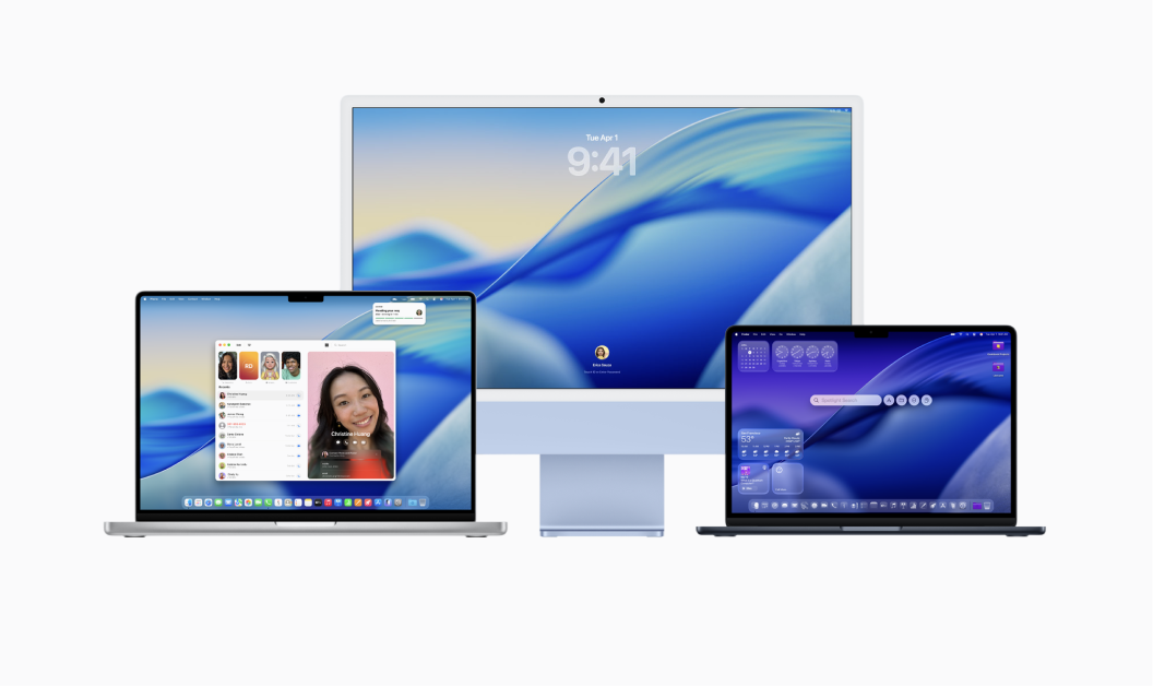
Caption: A macOS screenshot that captures the full effect, showing completely transparent widgets and a menu bar.
When I compare these navigation components, I see a huge difference in how the two approach depth. Google is creating a more fluid system where the navigation is part of the main content surface until you scroll, which triggers a state change with colour. The layers aren't fixed. Apple, on the other hand, is building a more rigid architectural model. The Liquid Glass's semi-permanent fixture on the Z-axis would be a challenge to work with on platforms beyond visionOS. That said, there could be iterations that might make the model a little bit more flexible.
Readability & Accessibility
Beyond the tech specs and design philosophies, the real test of any interface is the final human impact. Here, the contrast between M3E and Liquid Glass becomes its most stark, especially when it comes to readability and accessibility.
For me, the single biggest issue with the launch of Liquid Glass has been its effect on readability. From the moment the first-look videos dropped, there's been a huge wave of concern about accessibility. The high level of transparency, which is a core feature of the aesthetic, has been a source of usability problems.
My own early testing and plenty of anecdotal evidence online paint a troubling picture; there are several issues being reported here and here. Designers testing the subsequent betas, keep reporting that some screen elements fell way below the WCAG minimum contrast ratio of 4.5:1, with some hitting as low as 1.5:1. The core problem is that the transparency makes the UI's legibility dangerously dependent on the user's background.
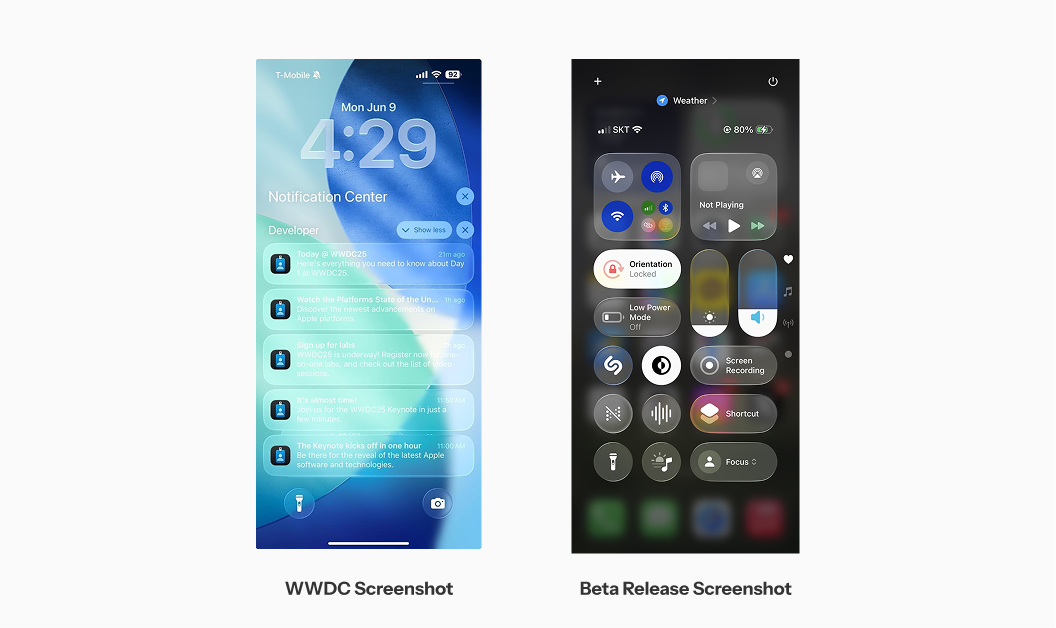
Caption: A comparison view of pre-beta lockscreen showing nearly unreadable white text notifications, in contrast this with a beta version iteration on blur adjustments
In the days to come, I am sure Apple will be iterating these usability concerns with updates to Liquid Glass, it will be interesting to see whether there will be any fundamental changes.
In Google's case, I noticed a critical catch in Google's own research: these usability gains only happened when expressive elements were applied to well-established UI patterns. When designers got too creative and broke basic rules, usability suffered, even if users thought it looked more "modern." The key takeaway is that functionality must never be sacrificed for visual flair.
Shadows & Depth: From Elevation to Refraction
The two systems also diverge in how they create depth. M3E mainly uses tone-based surfaces, where depth comes from applying lighter or darker shades of a surface colour. This results in a "flatter" but more colour-rich interface where hierarchy comes from the colour system.
Liquid Glass, goes all-in on simulated physics, where depth is actively rendered through a complex dance of light, shadow, and material. Elements cast soft, context-aware shadows, and the main way depth is created is through the refraction effect. As we referenced before, it will be interesting to see the computational effect on the devices.
System Maturity and Developer Experience
I believe the long-term success of a design system depends on its underlying tech, developer ecosystem, and how ready it is for the future. In this regard, M3E and Liquid Glass are making two very different bets, especially when it comes to AI.
Material Design Expressive is built on the mature foundation of Material 3. This makes adoption pretty straightforward for developers using frameworks like Jetpack Compose. The primary challenge for Google, in my view, isn't technology but logistics: its historical struggle with fragmentation. I've often seen Google get criticised for the slow, inconsistent rollout of its own design languages across its own apps, let alone across the entire Android landscape.
Apple's Liquid Glass comes with big challenges as it looks like its real-time rendering engine is computationally expensive and needs a lot of GPU power. I've seen early testing have a noticeable lag and battery drain even on relatively new phones. That said, Apple has historically been better with updates and fixes in the early days of a new OS.
Designing for the Age of AI
For me, the most fascinating difference is how each system is being positioned for an AI-driven future. Their approaches are mirror opposites.
Google is baking AI and Machine Learning directly into the M3E framework, using AI as a tool to make today's interfaces smarter. This is all about augmenting the current design process. Some examples I've found include:
- Adaptive Colour Systems: AI algorithms analyse a brand's palette to automatically generate accessible, WCAG-compliant themes.
- Predictive Layouts: On-device models study user patterns to dynamically adjust layouts.
- Accessibility Automation: Using Gemini AI to scan images and suggest alt text.
- Performance Optimisation: Using ML to predict and pre-render animations.
Google's strategy is about optimisation. It's using its AI expertise to make traditional 2D apps more efficient and personal.
Apple's approach with Liquid Glass isn't about using AI to build the UI, but about building a UI for AI. The translucent, layered nature of Liquid Glass provides a "quiet stage" where AI-powered info, like suggestions from Apple Intelligence or live translations, can appear and fade away gracefully without blocking your view. This design seems essential for the future of AR smart glasses. That said, we might be years away from seeing that all work on Apple platforms.
Conclusion: My Take on the Road Ahead
I think the simultaneous arrival of M3E and Liquid Glass marks the biggest philosophical split in mainstream design in over a decade. M3E is the pragmatic evolution. It's a research-backed, data-driven response to the real-world problems of brand homogeneity and user boredom. It gives designers a powerful toolkit to perfect the 2D interfaces we use today. Its greatest strength, in my opinion, is its focus on measurable usability improvements. Its greatest weakness remains the challenge of fragmentation in the Android world.
Liquid Glass is the ambitious revolution. It's visually distinctive, technologically demanding vision for a unified Apple ecosystem architected for a future of spatial computing. Its greatest strength could be its cohesive usage of its ecosystem. Its greatest weakness, as I've seen so far, is a concerning disregard for basic accessibility in its default state.
When I compare them on the key aspects of modern UI design, here's how I see it:
-
Aesthetics Factor: I have to give Liquid Glass the edge; its ambition of orchestrating an ecosystem-wide design is more futuristic.
-
Usability and Accessibility (Today): M3E has a decisive advantage in my book. Its choices are backed by research, while the unresolved accessibility concerns around Liquid Glass make it a risk.
-
Developer Practicality: At this point, I think M3E offers a more practical path for most developers. AI-coding and tools are ahead of the curve in Google's platform.
Looking ahead, I see Apple's approach to Liquid Glass as prep work for AR interfaces and possibly laying the foundations for the future beyond the first-gen Vision Pro. While, Google will continue to battle the beast of fragmentation and it will be interesting to see how much of AI-tools and models be useful to go about it.