


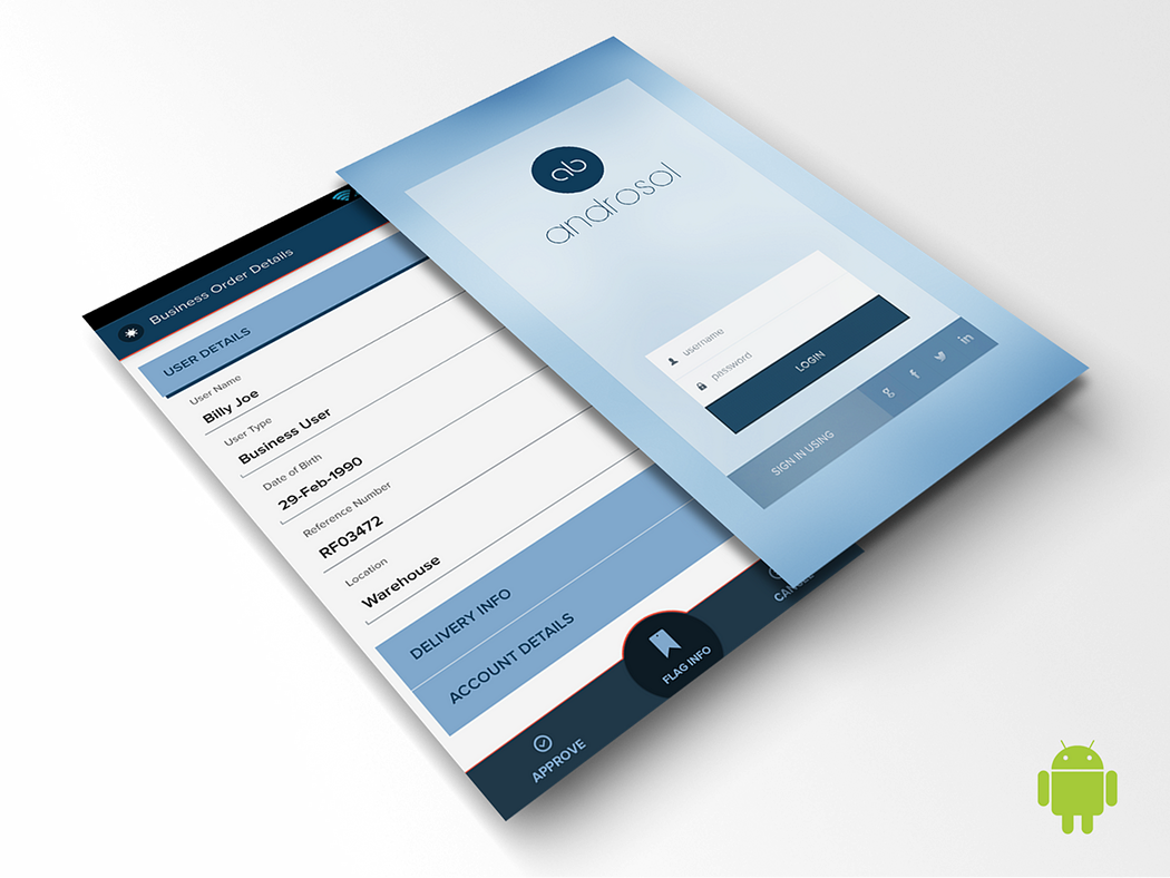
Hi all, few weeks have passed after joining Karya and I got the chance to design few mobile apps. The first one was the redesign for an existing application for QuickBooks known as QBReflex into Mobile Accountant and I was assigned to overhaul the entire application’s look. I just did this one from web perspective as I didn't get through guidelines then & also the deadline was short. But now, after going through the guidelines I got to know a lot about it and why it is essential. While doing so, small doubts kept creeping and sometimes there were terminal questions. Getting those clarified was a bit of a drag as there wasn't enough help available online and the design pattern for android was in a very preliminary stage. Cole Peters’s article on From Web to Native has already focused on the importance of designing by the iOS HIG, So I thought of sharing my perceptive for the android platform.
Following the design guidelines is always important
Most of the designers today are obsessed with custom design overriding the native controls, which is a good thing but if the designer doesn't know the basic guidelines, it becomes tough scenario for developing the application specifically on a platform like android as the hardware specifications are scattered. While designing a rough sketch, guidelines will be of less use but the same is not the case when doing a final mock-up. Communicating with the developers while designing the application simultaneously becomes a key process.
While I was designing an app, I encountered two different set of developers who were totally opposite in their approach. One was happy with the custom controls and the other was strict to go with the native controls. At the end of the day, the client needs his project to be completed and the native design is the key to do it, as it takes less amount of time & resources for development & testing scenarios.
Progressive enhancement should be the key when taking the native design route as further enhancements for the application can be done in the successive versions while keeping the interface familiar for the users. So it is obvious to design with the solid foundation.
Setting up the Photoshop workspace is the key here as Android screen sizes are measured in DPI. Google suggests to go with MDPI as 1 DPI here is equal to 1px. From there on we a can calculate for the rest of the screen sizes. Teehanlax and Raminteractive have some superb DP calculators and using this we can work out the math for other screen sizes. Some designers indent to design for HDPI screen size and then support the other sizes, while some may start with the MDPI and then move to the others. Whatever the approach, it is important to change the workspace from pixels to points and also to change the PS ruler to points. In a normal MDPI scenario,Google suggests to use a 48 DPI for a touchable area and I have seen many mock-ups neglecting that. User experience is affected when defying those rules and it even gets icky when you can’t use it. When I was browsing around for more information, I found PHENBACH’s guide on setting up the workspace for HDPI screen sizes and his DP helper which was quite handy to set up the workspace.

While I was designing my first application following these guidelines, it gave me a clear idea of what to do and how to do. But the application didn't look outstanding as I had to incorporate a lot of the native design elements killing most of my custom controls. Some of these controls looked good but it simply had to be dropped as development would take time. I was convinced because it is not the look that matters but the UI and how much better the UX. The client here was a total layman and the app was all about data. I mean the real data, ERP stuff. So I had to give a lot of importance on how it can be presented in an accessible way. After working on the application, I was confident to design & develop any application that will support backward compatibility and wide range of hardware specifications. Guidelines can sometimes become a boundary when taking the design to the next level, but one should never forget that defying the guidelines means, a lot of support should be done to make it work across platforms, versions and most important communicating it to the developers while keeping the UX in perspective.
Cheers
This article was orginally published on Medium here. I have reposting it here for keep the source handy for future reference.